| Saints Release 2020/21 Home Kit 09:45 - Jul 8 with 705 views | SaintsNews |
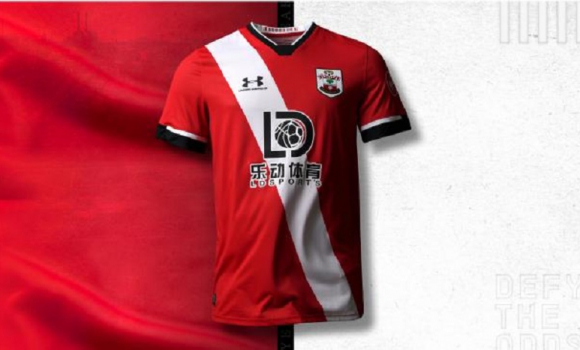 Saints Release 2020/21 Home Kit 8th Jul 2020 09:42Saints have released their new home kit for next season and it is another retro design, It's a nice kit, but it is not the strip that Southampton Football Club are associated with around the world. Saints Release 2020/21 Home Kit 8th Jul 2020 09:42Saints have released their new home kit for next season and it is another retro design, It's a nice kit, but it is not the strip that Southampton Football Club are associated with around the world.  10 10
If you want to remove this post from the board index, just click the hide post icon below. To hide all our news posts click the ignore user icon under the avatar. |  | | |  |
| Saints Release 2020/21 Home Kit on 10:53 - Jul 8 with 651 views | Saintsforeverj |
Totally agree. I bought the shirts from 2 years ago with the red and white stripes for 10 pounds in the sale. I won't be buying this one. Not saying it doesn't look good but Saints should be red and white stripes imo. [Post edited 8 Jul 2020 10:54]
| |
| |
| Saints Release 2020/21 Home Kit on 12:05 - Jul 8 with 589 views | SonicBoom |
I like it. We have departed from stripes a few times over the years and if we are going to do that then the sash is always a good choice.
It's way way better than the last two home kits which were an awful combination of badges, stripes, and black panels.
The only downside is the huge Lander logo and the Chinese writing that makes it look rather messy. |  | | |
| Saints Release 2020/21 Home Kit on 13:19 - Jul 8 with 538 views | clunk76 |
Thats the best kit they've had for a long time.
It will be the first shirt i've purchased for several years. Nice! | | | |
| Saints Release 2020/21 Home Kit on 17:19 - Jul 8 with 438 views | TripleNiemi |
| Saints Release 2020/21 Home Kit on 12:05 - Jul 8 by SonicBoom |
I like it. We have departed from stripes a few times over the years and if we are going to do that then the sash is always a good choice.
It's way way better than the last two home kits which were an awful combination of badges, stripes, and black panels.
The only downside is the huge Lander logo and the Chinese writing that makes it look rather messy. |
I don't mind the Lander / Chinese logo but hate the Saints badge. It's almost a spin back to the 90's. I actually prefer the badge straight onto the shirt with no shield or background and always like the white ball with no black.
Mind you the kits (aap red / gold) plus a few others where the badge was one colour was the bollőx. Hate to say this, but i actually preferred some kits that weren't red and white stripes.  |  |
| Ready and waiting to mop up those European places...... |
| |
| |