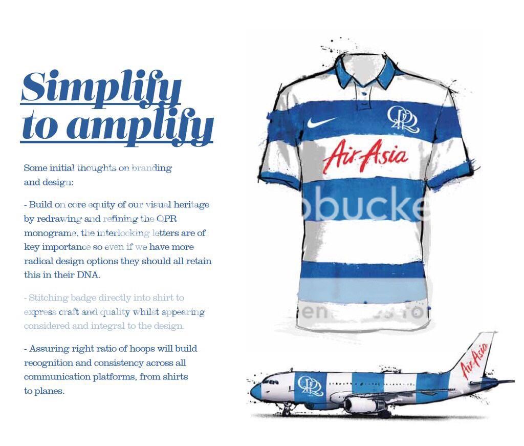
| Kit 01:08 - May 25 with 15508 views | AndyB |
Found on Twitter.
No idea where or why this was done - but I think is pretty good.
Love the simple badge.
 |  | | |  |
| Kit on 02:19 - May 25 with 9703 views | RType |
That looks absolutely mint I reckon. Really hope that it the new kit. |  | | |
| Kit on 02:56 - May 25 with 9678 views | Nov77 |
Yep, like the idea of the interlocking letters. Looks good, far better than fabio's extravagance. |  |
| |
| Kit on 03:10 - May 25 with 9667 views | PunteR |
Its not hard is it...... Q.P.R.
Get rid of the fluff,the crown on top of the football. the football. All the peripherals.
Just Q.P.R |  |
| Occasional providers of half decent House music. |
| |
| Kit on 05:52 - May 25 with 9601 views | Seth_Gecko |
Smart as |  |
| Everybody be cool, you be cool... |
| |
| Kit on 06:14 - May 25 with 9571 views | Hooparoo |
Nice. Proper hoops - yes please! |  |
| |
| Kit on 07:05 - May 25 with 9520 views | Rs_Holy |
| Kit on 06:14 - May 25 by Hooparoo |
Nice. Proper hoops - yes please! |
100% YES | 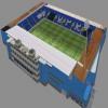 | | |
| Kit on 08:15 - May 25 with 9351 views | RuislipHoop |
Great kit, great badge, if only though. | | | |
Login to get fewer ads
| Kit on 08:27 - May 25 with 9315 views | DWQPR |
And the apostrophe is back! i hope that this is work commissioned by the club. sad thing though is that anyone of us would have come up with these 'ideas' at a cost of a meal deal at Loftus Road. | |
| |
| Kit on 08:46 - May 25 with 9250 views | CiderwithRsie |
That whole tweet is bang on. And mainly consists of going back to what we had 20 years ago with a couple of minor adjustments.
It'll never happen. Some t*sser will be paid a shedload to screw things up. | | | |
| Kit on 09:35 - May 25 with 9108 views | GetMeRangers |

It would be a great statement of the back to roots/ change of direction at the club if that was the kit. Absolutely love it |  | | |
| Kit on 09:40 - May 25 with 9081 views | QPR_John |
This is a no brainer. | | | |
| Kit on 09:57 - May 25 with 9025 views | toboboly |
| Kit on 08:27 - May 25 by DWQPR |
And the apostrophe is back! i hope that this is work commissioned by the club. sad thing though is that anyone of us would have come up with these 'ideas' at a cost of a meal deal at Loftus Road. |
This. It's not like these things haven't been spoken about. If this is they way they are going to go I can see people applauding them, when in fact they could have done this 3 years ago. The badge is bad but their constant need to do crappy French hoops or even faking stripes this season seriously pisses me off. This lot would Fock up a knees up in a brewery then tell you they did well cos someone got a six pack from the offy. Tvvats. |  |
| Sexy Asian dwarves wanted. |
| |
| Kit on 10:00 - May 25 with 9010 views | baz_qpr |
| Kit on 09:35 - May 25 by GetMeRangers |
It would be a great statement of the back to roots/ change of direction at the club if that was the kit. Absolutely love it |
Its a polo / rugby shirt cut and would very different in real life with straight lines, single tone colour and none of this over stylised pretend pen effect that's been used in the drawing. - Not keen myself other than the hoops being the right size |  | | |
| Kit on 10:25 - May 25 with 8931 views | CamberleyR |
| Kit on 08:15 - May 25 by RuislipHoop |
Great kit, great badge, if only though. |
True. We'll probably end up with whatever the work experience boy has been tasked with that day. |  |
| |
| Kit on 10:30 - May 25 with 8916 views | TheBlob |
It's still too fiddly imo.
Would prefer the typface from the 1970's.......
 |  |
| |
| Kit on 10:37 - May 25 with 8896 views | CamberleyR |
| Kit on 10:30 - May 25 by TheBlob |
It's still too fiddly imo.
Would prefer the typface from the 1970's.......
|
The only problem I have with that is it looks slightly messy with the 'R' going into the border part. Other than that I'm all for going back to the mid 70s crest as that was the crest introduced just after I first started supporting the club. | |
| |
| Kit on 11:17 - May 25 with 8808 views | bosh67 |
I think the guy is bang on with this design. |  |
| |
| Kit on 12:06 - May 25 with 8719 views | thorpebankR |
Tis a thing of beauty |  | | |
| Kit on 12:37 - May 25 with 8651 views | Toast_R |
| Kit on 10:30 - May 25 by TheBlob |
It's still too fiddly imo.
Would prefer the typface from the 1970's.......
|
Looks like a felt tip pen job. Reeks of 70s. |  | | |
| Kit on 13:24 - May 25 with 8576 views | Gloucs_R |
| Kit on 10:30 - May 25 by TheBlob |
It's still too fiddly imo.
Would prefer the typface from the 1970's.......
|
Personally hate that badge. Looks like a child has drawn it. |  |
| |
| Kit on 13:35 - May 25 with 8552 views | RANGERS4EVER |
| Kit on 10:30 - May 25 by TheBlob |
It's still too fiddly imo.
Would prefer the typface from the 1970's.......
|
In my opinion i have always though that looked slightly tacky, just because it looks quite messy, like it was done on WordPaint |  |
| |
| Kit on 13:51 - May 25 with 8521 views | qpr1976 |
Pretty pointless exercise suggesting a new kit design.
Club had to give Nike 18 months notice for shirts NOT off the shelf.
As mentioned by TF when we signed to Nike.
As such, next seasons designs would have been submitted to Nike in.....
February 2014 !
(assuming we want to start wearing and selling them in August 2015 !) | | | |
| Kit on 14:05 - May 25 with 8489 views | DylanP |
| Kit on 08:27 - May 25 by DWQPR |
And the apostrophe is back! i hope that this is work commissioned by the club. sad thing though is that anyone of us would have come up with these 'ideas' at a cost of a meal deal at Loftus Road. |
What apostrophe? |  |
| |
| Kit on 14:13 - May 25 with 8465 views | Neil_SI |
I've seen this mock up before, it's absolutely gorgeous. |  | | |
| |