 Thursday, 1st Nov 2018 09:00 Wearing your teams’ badge is more than just a matter of pride, it is an extension of the family with more than a few fans adopting their clubs crest as a tattoo. Over the years, Premier League clubs often ‘rebrand’ themselves and bring out a new logo design, but the standards of the club always remain the same. The club badge tells its own story and its design will become global. Tottenham Hotspur A cockerel purched on top of an old school leather football may sound a little daft on the face of it, but the truth be told the simple design looks smart and instantly recognisable as Tottenham Hotspur. The club are about to embark on a new era with their new stadium but have rather ironically done away with their motto ‘Audeat-est-facere’ emblazoned on their logo. That translates into ‘to dare is to do’ and comes from a remarkable story relating to the club dating back to the 1300’s in which a certain English knight famed for his bravery often wore spurs into battle. The creative team at Spurs have done a great job and, in this case, less really is more. AFC Bournemouth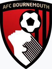 What’s not to love about a long-haired person heading a ball? However, there is more to it than just a cool logo, Bournemouth’s crest is designed to be about progress and was first brought to the fore in 1971. The silhouette is supposedly Dicky Dowsett who was a prolific striker for the club in the late 1950’s and early 1960’s with the club looking to follow in Dowsett’s example. Crystal Palace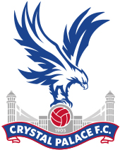 The Eagles turns out to be a very appropriate nickname for Crystal Palace. An Eagle holding a football in front of a palace is the Selhurst Park club’s logo and it is not hard to see where their inspiration came from. However, it wasn’t until 1973 that Palace became the Eagles as inspiration was born from Portuguese club Benfica to adopt an Eagle as the club’s logo. In 1987, Palace then merged the Palace façade into the design and had an update in 2013 to bring it up to how it looks today. Manchester United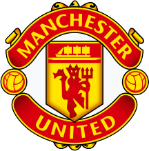 How could we not include arguably the most recognisable emblem in world football? Any badge that features a devil with a pitchfork must be cool and a way to intimidate the opposition. The devil first appeared on the United badge in 1970 but just prior to the logo change the club under Sir Matt Busby borrowed the idea of the nickname from local rugby club Salford who were first known as the Red Devils. Southampton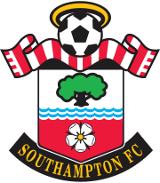 A scarf, a halo, a football, a tree, you name it Southampton’s badge has it and looks great for it too. As the club were formed by the St Mary’s Church young men’s association, it is no surprise to see a halo on the crest although a badge did not come into effect until 1974 after the club launched a competition in 1973 to design a logo. Since then, there have been few changes to the logo since the 1980’s with the Saints boasting one of the most eye-catching club crests of all. Photo: Action Images Please report offensive, libellous or inappropriate posts by using the links provided.
You need to login in order to post your comments |
Tottenham Hotspur Polls |
We in turn value your personal details in accordance with our Privacy Policy.