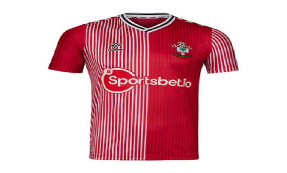
Saints Launch New Home Kit For 2023/24 Season Monday, 19th Jun 2023 12:40 For a second season running the Southampton FC fanbase will not be entirely happy with the design of the home kit, on one hand it does have historical links, but on the other. the original was one of the most despised Saints kits of the 1980's. A year ago the SFC marketing department was criticised for not only the design of the new home shirt for 2022/23, a kit that had almost no red in it at all, but also the patronising press release that came with it, A year on some of those responsible have left, but it seems they have left us with a parting shot with a kit that is an exact replica of the kit worn from 1987-1989. The kit manufacturer back then was as it is today hummel, and they produced a kit for us based on the design they had produced for the Danish team in the 1986 World Cup in Mexico, this kit was not exactly original at club level either, Aston Villa had a similar design in Claret & Blue and Coventry City in Sky Blue & White and I think a few other clubs also had their version. Now SouthamptonFC have just launched the 2023/24 home kit.
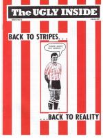
It is fair to say that in 1987 this kit was not exactly well received, yes it had stripes, but not as we knew them, it was worn for two seasons and yes did see some iconic players such as Francis Benali, Alan Shearer, Matthew Le Tissier & Glenn Cockerill wear it, but it was not a great period in the club's history. In fact the fledging Ugly Inside Fanzine that first hit the streets in April 1988, celebrated it's first full season of publication in 1988/89 by launching its SOS campaign, standing of course for Save Our Stripes, it took up the cause that Southampton FC had not worn a home kit based on traditional stripes in 13 years.
This campaign proved successful and for 1989/90 it was a hummel kit that was as traditional as it could get, it rallied the team both on and off the pitch with the club finishing 7th in that season. So those of around in the 1990's find it puzzling why those Saints supporters who weren't even born then sit back and watch marketing campaigns that tell us these retro kits were much loved. As I have said before some football teams are defined by colour, but the most iconic are defined by their home shirt, red & white stripes is our history & it is our heritage, it is what makes us stand out, would Manchester United or Liverpool put out last season's shirt, or indeed this shirt and get away with telling their fans it is in the club colours and that is what matters ? I think we all know the answer there. In truth Saints are the second Southampton based team to jump on this design, AFC Totton have been wearing a blue and white identical shirt for the past two seasons. It is not the worst football shirt I have seen, indeed it is not even the worst Saints design, there are several other contenders for that one, but it is still not a Southampton FC shirt, it is Denmark 1986 and a plethora of other clubs both in the 1980's and also who jumped on the bandwagon a little earlier than us in the past couple of years. The one good thing is that this years press release is not so patronising, it is good to see the club highlighting the crest, this badge has been on the front of our shirts since 1974 and aside from a slight tweak on the ball, it is the only badge we have worn on our shirts in our history.
It is therefore iconic in that in encompasses our heritage, the club nickname with the halo, the sport of football with the ball, the scarf to recognise the fans, the tree and sea recognise the New Forest & the sea that surrounds the City and the white rose & red background the city crest. This is where the marketing goes wrong, "The 2023/24 home shirt focuses on the Hampshire rose, with over a thousand small roses subtly printed into the shirt in a diagonal pattern. On the reverse of the shirt, at the nape of the neck, the Hampshire rose proudly sits symbolising the city of Southampton. " Yes the Red rose is Hampshire, but we are not Hampshire, we are Southampton, Hampshire is a big place and is also home to Portsmouth. "At the nape of the neck sits the Hampshire rose sits symbolising the City of Southampton" Only it doesn't, the Hampshire rose is Red, the City of Southampton crest usually has a white rose on a red background, as on our club crest as mentioned. Nit picking yes, but it makes you wonder how little attention those who design football shirts actually pay to detail, these things are easily googleable. Photo: Action Images Please report offensive, libellous or inappropriate posts by using the links provided.
You need to login in order to post your comments |
Blogs 31 bloggersColchester United Polls[ Vote here ] |
We in turn value your personal details in accordance with our Privacy Policy.